
You may have read or heard the acronyms RGB, CMYK, and PMS while designing, but you may not be familiar with what each acronym means or, more importantly, why it matters. If you want your final design to look the way you intended, it’s essential to become familiar with each of these color profiles and the differences between them.
What is RGB?
 The RGB color profile, which represents the same colors used in computer screens, televisions, and mobile devices, is only utilized in digital design. The RGB color wheel’s hues are made by combining light, not ink.
The RGB letters represent the colors used to create different hues: Red, Green, and Blue.
RGB is projected utilizing light against a screen rather than a physical canvas. White and lighter tones are produced when all three hues are used simultaneously at increasing intensities, while black is produced when less light is used against a darkened screen. Be aware that darkness occurs from the absence of RGB color. Unlike the other two color versions, where the absence of printed color typically signifies white, this one does not.
It’s important to remember that no two devices are calibrated the same way. This implies that an RGB color may appear somewhat different from screen to screen.
What is CMYK?
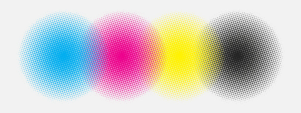 The CMYK color model uses four separate colored inks to produce a variety of different hues, it is frequently referred to as a four-color process. Cyan, Magenta, Yellow, and Key (Black) are the four colors used in printing that give the method its name CMYK.
Black is referred to as the “key” color because it is the color utilized in the key plate, which provides the contrast and detail for the final image. The key tone can be any color with other printing processes (such as two-tone printing), however, the key color in CMYK is invariably black.
Technically, the white of the paper stock that you print on counts as a separate “color” in the CMYK profile. Tonal changes are produced by layering CMYK ink at different densities; the less ink used, the more white appears, producing a lighter tone. That’s why printing on anything other than white material could result in color inconsistencies when designing with the CMYK model.
Because CMYK colors are blended throughout the printing process, there may occasionally be very tiny color variations across a printing run. When employing logos with specific color branding, it’s usually not a very noticeable shift, but is still something to keep in mind.
What is PMS?
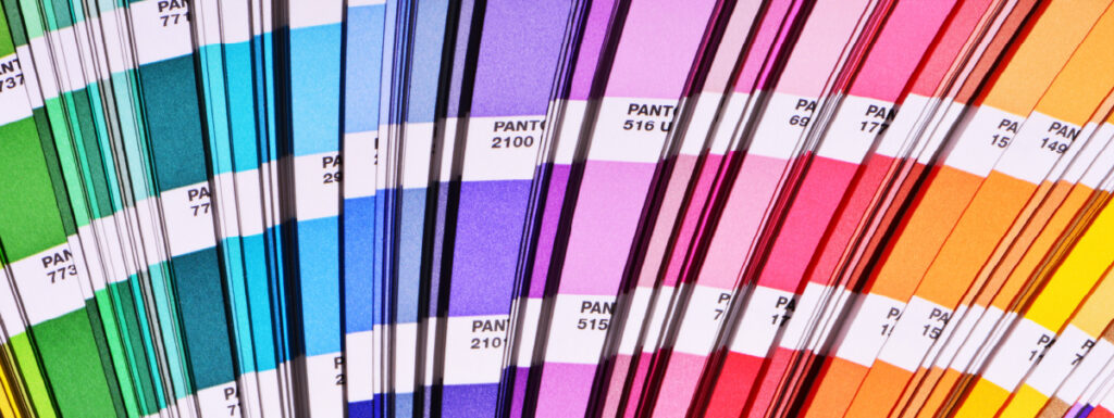 Pantone Matching System, or PMS for short, is a worldwide color-matching system largely used in printing.
PMS colors, in contrast to RGB and CMYK, are made with premixed ink long before the image is ever produced, yielding the most uniform color possible.
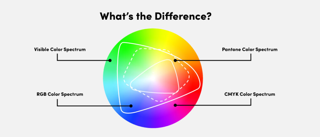 In the above spectrum approximation, we can see that RGB, used for digital designs, has the largest and most vibrant color spectrum, allowing for dazzling use of color. Pantone colors are grouped in a smaller color spectrum and consist of pre-mixed ink colors, which ensures the end result will be consistent each and every time.
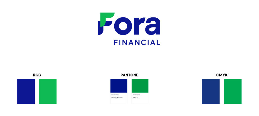
When matching Pantone colors to RGB for printed brand collateral, it’s always a good idea to engage in proper print testing runs to ensure close consistency with the digital environment. While CMYK is limited by the smallest color spectrum in comparison to RGB and PMS, it is capable of achieving a wide range of colors and is the go-to method for printing collateral that has full-color photography.
It is important to remember that RGB and PMS colors outside of the CMYK gamut will appear duller when converted to CMYK. Consistency with CMYK can be an issue because the ink is mixed at the time of printing. It is common to utilize CMYK and PMS to achieve brand cohesion across printed collateral.
What is Spot Color?
Spot colors are solid hues produced with a particular premixed ink, frequently based on PMS hues. Because Pantone colors are defined and designated with unique numbers and names, designers and printers can quickly recognize the same exact color from a distance. Spot colors are strong and brilliant, but the printer will definitely charge more for the job if you’re the design requires offset printing.
When to Use Spot Colors (Such as PMS Colors)
Spot colors may be the most practical option if your project satisfies one or more of the following requirements:
- The print does not have full-color photographs and only uses one or two colors, including one spot color and black
- The print requires a color that cannot be properly replicated using CMYK inks, such as an exact match to the color of a company typeface or logo
- To consistently print one color from page to page across several pages
- To print something on a big canvas, like a poster (spot color inks may provide more even coverage)
- The print needs more vivid colors than what CMYK inks provide
- Special effects, such as metallic or fluorescent spot inks, are required for the project
What is Process Color?
Process color is CMYK printed as countless tiny, overlapping dots that, once combined, produce the full spectrum of colors. By using no more than four printing plates for a task, this printing technique becomes more cost-efficient. But, it is worth noting that the precise colors that CMYK inks can produce have significant restrictions.
When to Use Process Colors (CMYK)
When the following circumstances exist, you might want to employ process colors:
- The publication includes photos in full color.
- The publication has images with multiple colors that would require a variety of inks to reproduce in spot colors.
- The publication requires more than just two spot colors.
When to Use Process and Spot Colors Together
CMYK can produce a wide range of colors, but it cannot produce all of them. A fifth color is often used in printing publications. Here are a few instances:
- A full-color publication uses special spot colors that can’t be produced with CMYK inks (such as a logo color or a metallic ink)
- Adding a spot color ink to a particular process color enhances or increases its intensity
- To create a full-color publication (book or brochure) with multiple language versions (variable printing). With the exception of the changeable text, all printing is done in CMYK
- A clear varnish is applied to specific areas of a full-color magazine
Color is Complicated
Whether you’re printing a logo or a piece of art, selecting the appropriate technique and color profiles that makes your product look as good in real life as it does on a computer screen is vital. It can be challenging to determine whether spot color or process color is the best strategy for your print project, but depending on what you want to print, both approaches offer specific advantages and disadvantages.