The design, content, and usability of your entire website affect how potential customers view your brand. However, the importance of a well designed and thoughtful page reaches a boiling point on your landing pages.
While your entire site is suited in different areas for your various users at their unique step in the buyer’s journey, landing pages are tailor-made for action. Therefore, the conversion efficiency is kind of really important. The power of landing pages lies in their ability to:
- Generate leads – landing pages were born to do this, and their effectiveness fuels your business
- Uncover Demographic Data – information gathered about a lead from a landing page is essential for understanding the user
- Guide visitors to make a decision – when done well, information and action is laid out for users so that making a decision is easy
When landing pages work they become a major driver for your lead generation efforts. Now let’s explore how to make landing pages work for you.
How to Create SaaS Landing Pages That Convert
Your SaaS website gives you the opportunity to educate and persuade potential users across a variety of pages. However, landing pages only give you one shot. Here are the five must-have design principles for creating SaaS landing pages that convert.
Simple Navigation
A SaaS landing page is only a single page on your site, but that doesn’t mean we want to trap visitors there. While it’s true we shouldn’t overwhelm them with options and content; there is a proper way to direct inquiring minds around the site.
An analysis of SaaS landing pages found that the average number of navigation items is 4. Limiting yourself to only a handful of navigation options forces you to choose wisely about what information and pages would best serve the type of user that will visit the page. Some common navigation items include pages for your products and solutions, your pricing, and who the SaaS is for.
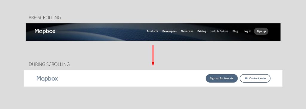
Additionally, 63% of SaaS landing pages use “sticky” navigation. When a landing page uses “sticky” navigation, only a few key navigation options, such as a CTA, will stay at the top of the screen as the visitor scrolls down. In the Mapbox example below the navigation reduces to a CTA only as they scroll down the page so that the focus stays on converting.
Compelling Offer Above the Fold
There’s no doubt that the content and copy of your landing page matter, but their design and placement have an impact as well. Your SaaS landing page copy design needs to be easy to read and clean, and your compelling offer should go above the fold. The vital info above the fold puts a visitor’s entire focus on what you have to say, and the placement at the very top means it’s the first item they’ll see.
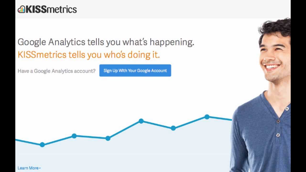
In addition to copy, your “hero” image needs to be presented to showcase your company and offer. This can be accomplished by humanizing the product by including an image of a person, like in the example below.
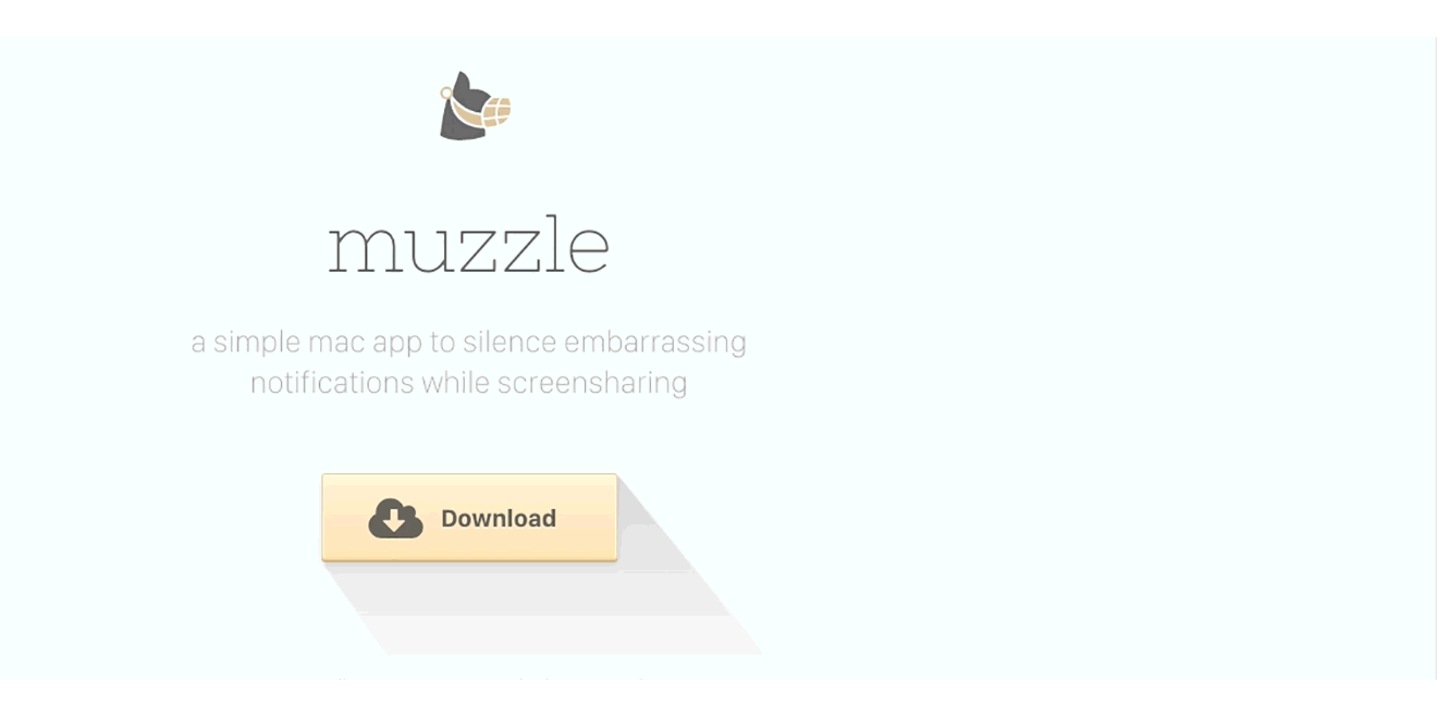
Your “hero” image doesn’t even have to be an image. It could be a video to explain better your value proposition or animation like Muzzle that showcases how their product works. Proper Space Around Content
Content needs breathing room, or “white space.” You aren’t limited to only the color white, but elements of the landing page need to be spaced out enough so that it is easy to read and not frustratingly-cramped.
The importance of white space means you shouldn’t be afraid of long landing pages, because scrolling is a natural reaction for users. In fact, both short and long examples of successful SaaS landing pages can be found.
There are different types of white space, such as the space between small elements like photos and captions, and space added around elements with the purpose of making the page more dynamic and structured. No matter the type, white space helps guide the reader’s eye, makes a page look more premium, and optimizes opt-in forms.
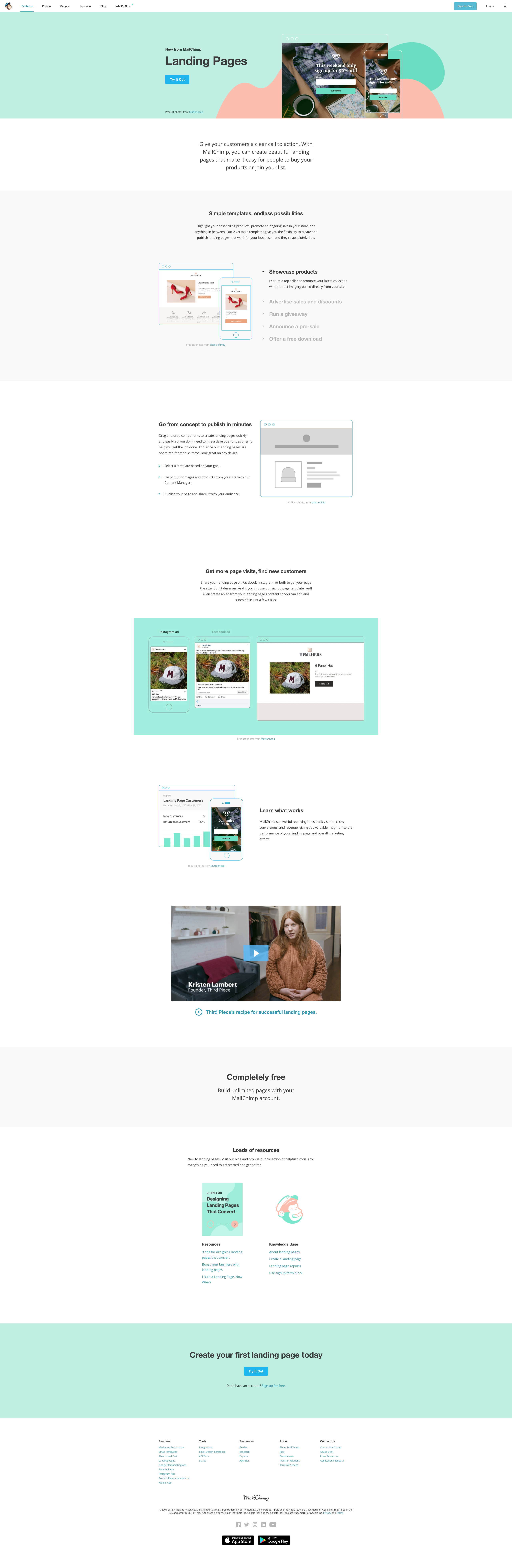
MailChimp puts white space around elements with a long page so that each section has attention placed solely on it. It’s true that the page is long, but it delivers a much more pleasant and impactful experience for the reader (or scroller). Visual Social Proof
Including social proof in the form of testimonials, case studies, number of customers, big brands who use your product, or press mentions can be powerful. However, they need to be presented in the right way.
One way to make social proof work for your landing page is to add visuals that reinforce the testimonials and make them more visually impactful.
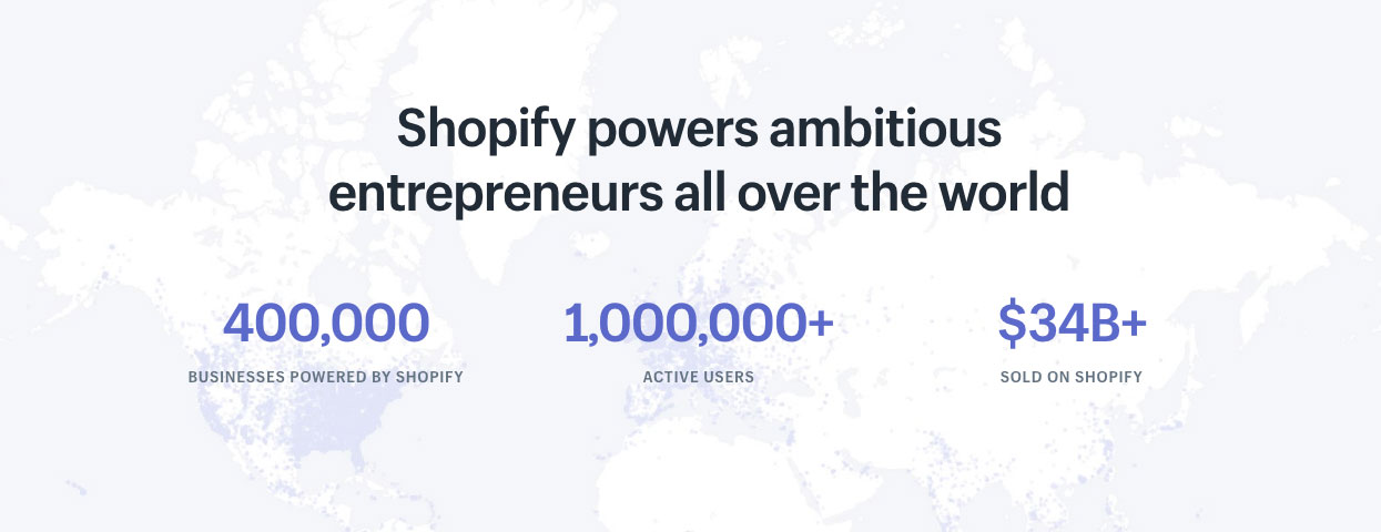
Shopify does this in the example below by illustrating their global reach. It seems simple, but adding an image of the world behind their copy about powering entrepreneurs all over the world drives the point home. An image like the globe that breaks up text sections is also more attention-grabbing than copy and numbers alone.
Bold and Clear CTA
There’s no escaping the importance of the CTA, especially on a landing page. The primary goal of a page is to inspire action and generate leads. You better believe you need to spend time testing and perfecting it.
In addition to your copy, bold and eye-catching buttons will significantly help your SaaS landing page conversion goals. What does bold and eye-catching even mean, though? A perfect CTA button will be in a color that sharply contrasts the page around it and is large enough not to be glossed over. Your CTA button also shouldn’t be surrounded by too many elements that disguise its importance. CTA buttons need white space too!
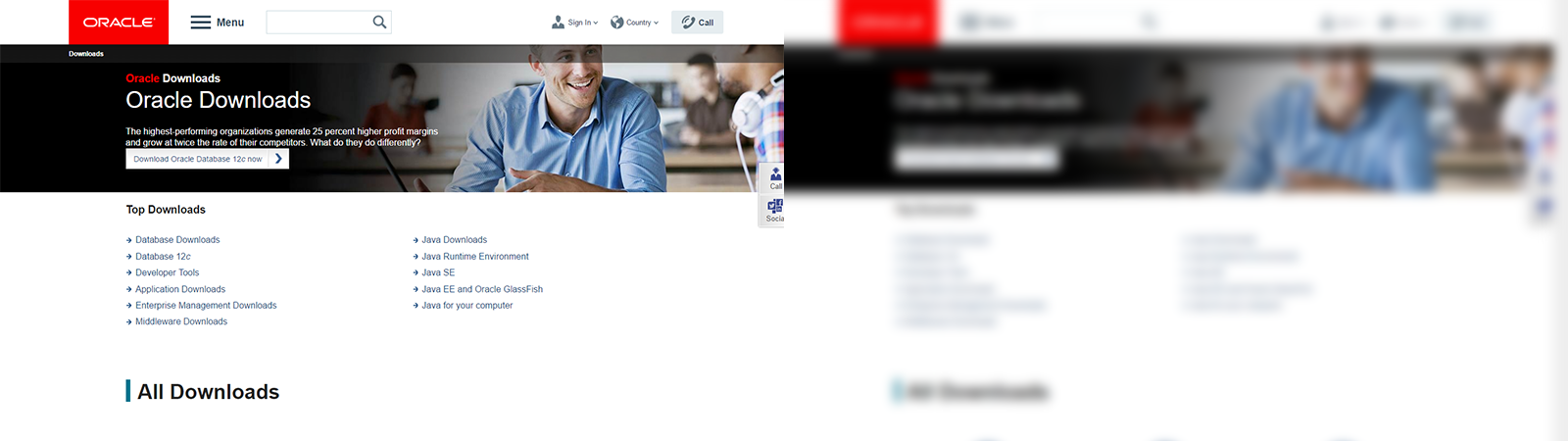
One way to make sure your CTA button is bold enough is to try “the blur test.” Using an image editor, blur a screenshot of the landing page and CTA design you had in mind and see if it still stands out. Prototypr presented the examples below.
In this first example, the inverted triangle of the headline and copy funnels your eyes down to a bold black button. This CTA passes the blur test.![]()
On the other hand, Oracle’s website didn’t fare as well on the blur test. Their white CTA button is in contract with the black background, but it’s surrounded by copy and is overpowered by Oracle’s big red logo.
Here’s a fun fact: the majority of SaaS CTA buttons are less than five words and either green or blue. The blur test examples above don’t follow these color rules. Maybe there’s a reason why so many SaaS landing pages opt for blue or green. You don’t think it could be because they’ve tested their CTA buttons, do you? There’s only one way to find out; test it for yourself.
Next Steps
By following the design principles we’ve covered, you’ll already start ahead of the competition. However, it’s important to test landing page design and elements to drive conversion rates higher. By doing so, you’ll move even further ahead of the pack, since 61% of companies run 5 or fewer tests a month on their website.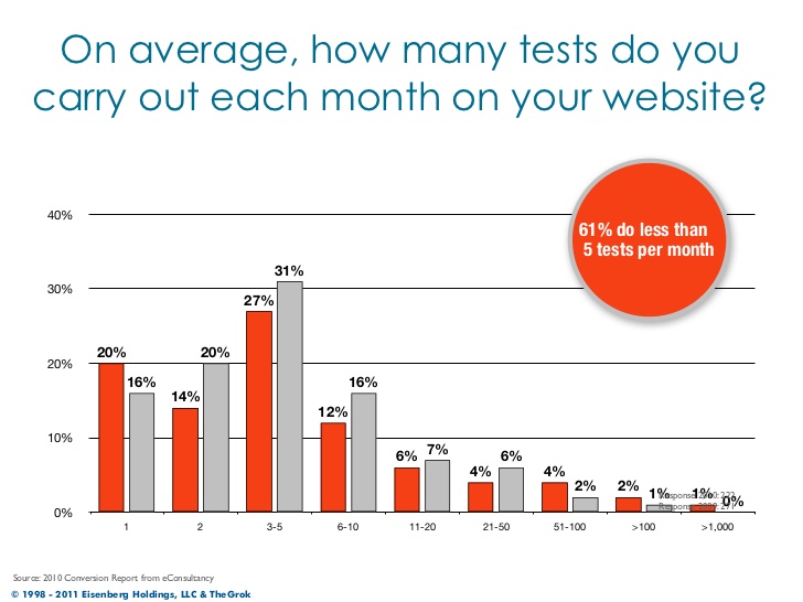
Even websites that have performed well in the past may start to fall off on effectiveness. Elements that you can test include page length, white space, layout, the pages you navigate to, copy, and yes; even blue and green CTA buttons. Establish an organized A/B testing strategy to make sure insights are clear and testing is optimized. Do this instead of trying new landing page elements randomly. However, even the most carefully planned A/B tests may not tell the whole story. That’s why it’s so important to use heat maps alongside A/B testing to get a full understanding of what your users react to on your site.
What are you waiting for? Let’s start testing and perfecting your high converting SaaS landing page.