Over time, redesigning your logo is one of the best ways you can respond to current trends and stay relevant. But when so many logos miss the mark, how can brands be sure they redesign right? While every logo evolution looks and feels different, the best visual transformations work to reinterpret a brand’s core values and mission in a fresh, relatable way. Watching the best logo redesigns can inspire your marketing efforts and keep you ahead of the consumer preferences driving your industry.
Let’s take a look at the best logo redesigns of 2017 – and what they can teach us about successful rebranding.
1. YouTube
Since 1995, YouTube has transformed into a go-to media conglomerate that makes up television, music, games and more. Despite its impressive product evolution, YouTube hasn’t updated its logo since its inception. YouTube’s 2017 logo update honors its brand integrity. Plus, it creates a more streamlined look that supports its modern products and services.
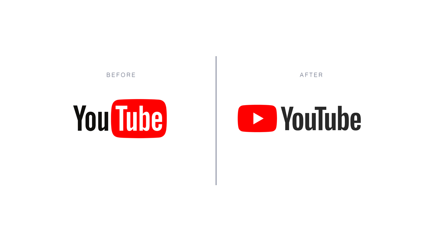
The media brand’s new logo emphasizes the brand’s play button, which has become an essential aspect of the YouTube user experience. The play icon alongside an updated wordmark helps reinforce YouTube’s role as a global leader in video sharing.
2. HuffPost
As the first digital-only news source in today’s saturated media landscape, the Huffington Post has a powerful claim to fame. The publication’s rebrand includes a new logo, an updated color scheme and a shortened brand name.
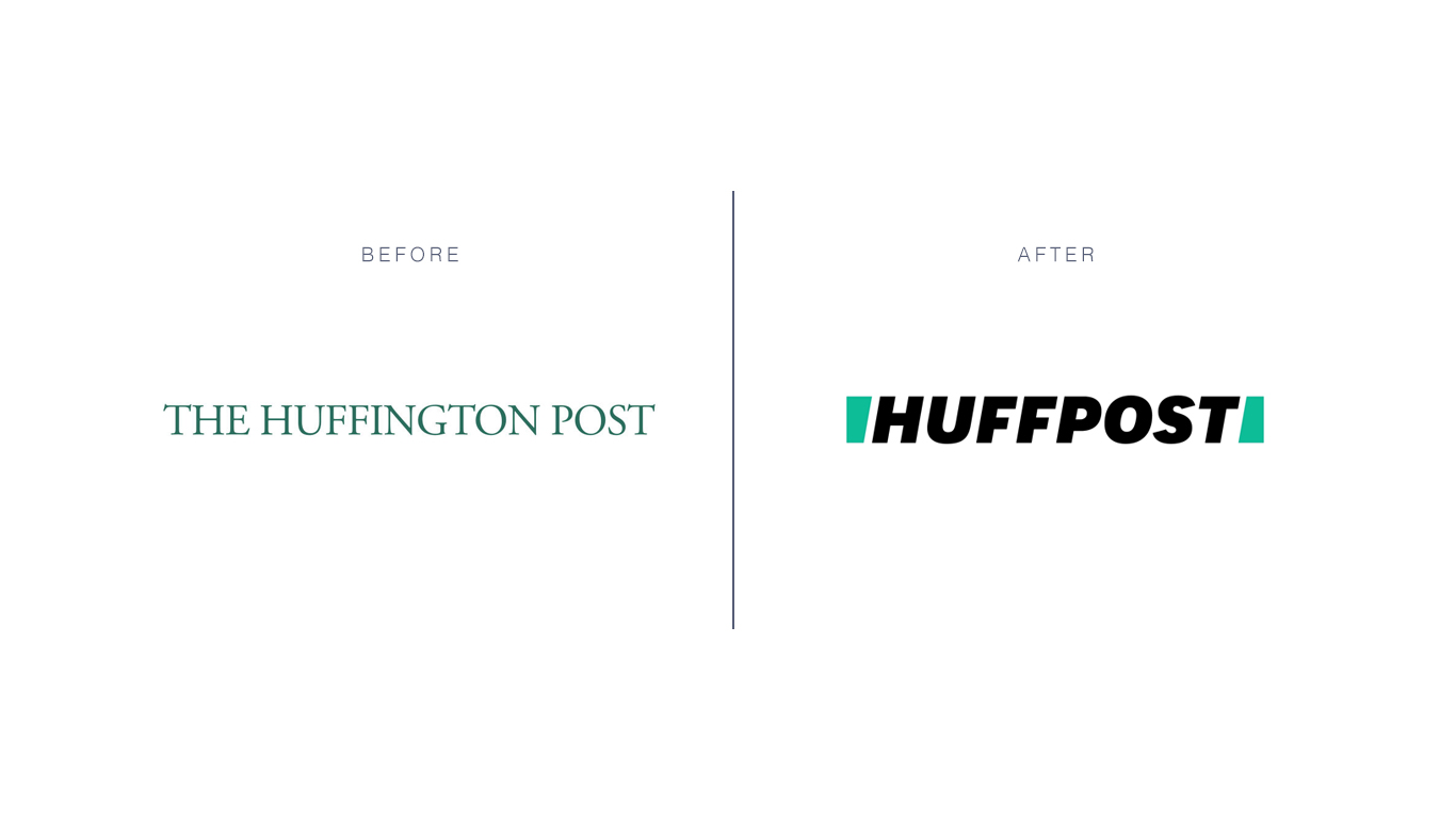
The new HuffPost logo is bolded and italicized to reinforce the forward-thinking goals of the liberal news outlet. The sans-serif wordmark with green blocks as bookends create an abstract “H” when pushed together. These minty green blocks also symbolize ideas of divisiveness and togetherness. And, how inclusive news can bring together people of different backgrounds.
Overall, this new brand identity helps elevate the Huffington Post’s image from an ordinary news blog to the cutting-edge informational resource it is today.
3. Converse
We all know the Converse brand for its Chuck Taylor All-Stars and it’s effortless street style. This year, a new logo helped them reinforce these traditions while creating room for new brand interpretations.
The fresh Converse logomark features an off-kilter star – its top point reaching northeast, instead of true north. However, the logo does succeed at creating a sense of motion as it leans into the crook of the classic Converse arrow.
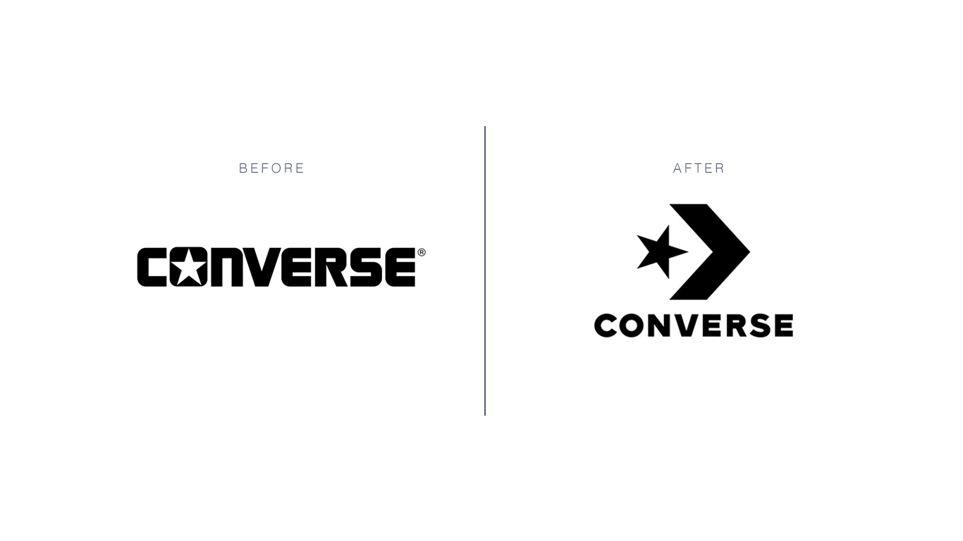
Walking physically forward and engaging in movement (as one does when they wear shoes, Converse’s core product) is a core part of the new logo. But in a less literal sense, the motion-filled star represents the conceptual idea of moving through time as vintage designs come back into fashion.
4. Campus
All brands associated with Google maintain an air of intelligence and innovation. Campus, Google’s global network of co-working spaces, wanted a new brand identity that would retain these associations and creae an original brand identity. Working with design studio MultiAdaptor, the new Campus logo assumes a cleaner, flatter look that coincides with the white geometric lines peppered throughout the new identity.
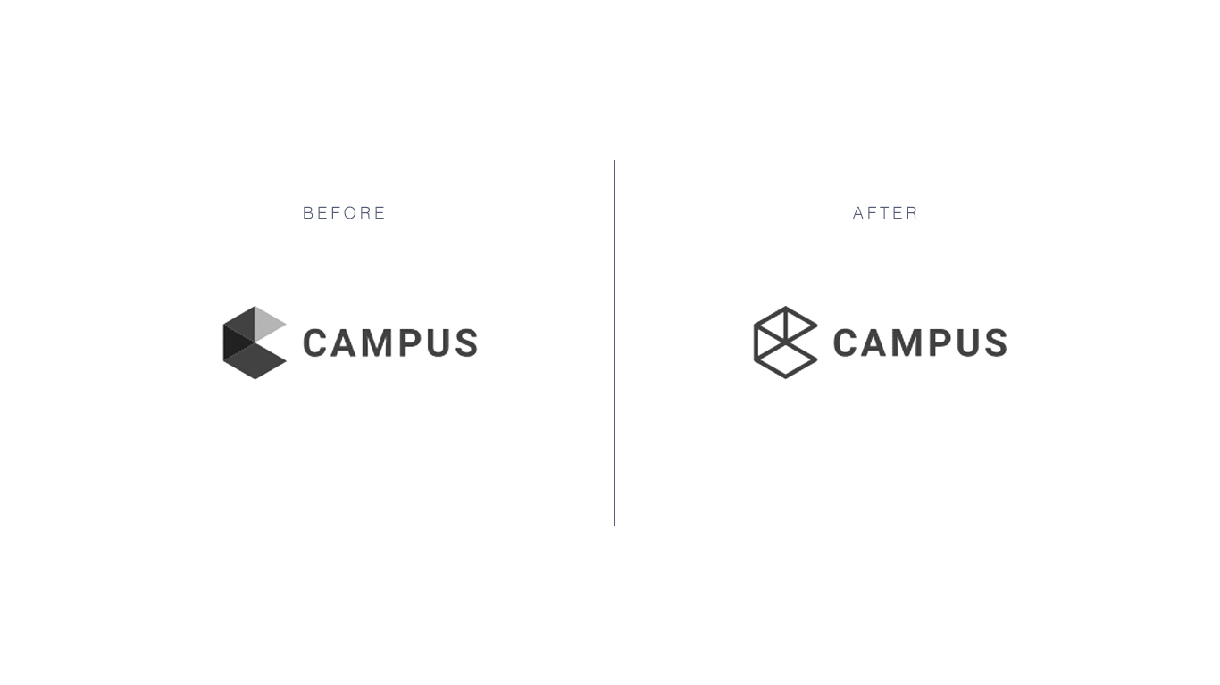
Campus maintains the colorful feel that’s representative of Google’s main brand. Yet, they rely less on primary colors and more on modern shades, imagery and patterns to evoke a sense of creativity and maker projects. These colors are also used in a more dynamic way. They are overlaid on lifestyle imagery and juxtaposed against bold type, serving as a vehicle to define each country’s unique user base.
5. Audi
Flat design has become ubiquitous across modern branding, and the most recent Audi logo reinforces the power of this trend. Audi’s flexible new logo is sleek, simple, and is suitable for digital environments. It’s also a bold move: forgoing the Audi wordmark requires the logo to be recognized on its own.
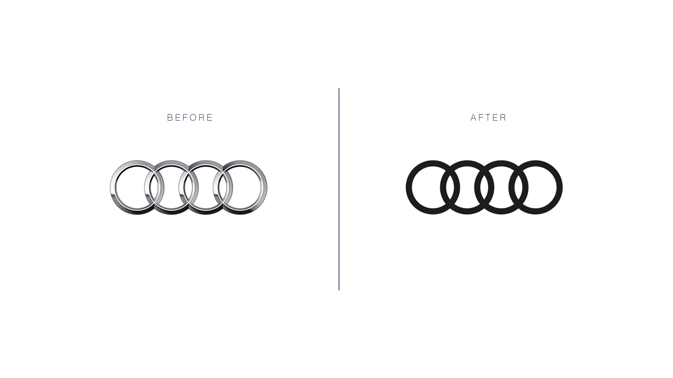
Removing a brand name from a logo can be a risky move – if the brand isn’t yet well-known.
Fortunately for Audi, its brand has become a reputable leader of luxury automobiles across the globe. 2017 seems like the perfect year for a brave brand move of this caliber.
6. Tinder
Tinder is another brand that ditched its wordmark for a sleek, image-driven logo this year. The popular online dating app redesigned its logo to reposition the hot-red flame that its so well known for. In-house designers morphed the ember into a slimmer shape with pink and orange hues that evoke a millennial-first vibe.
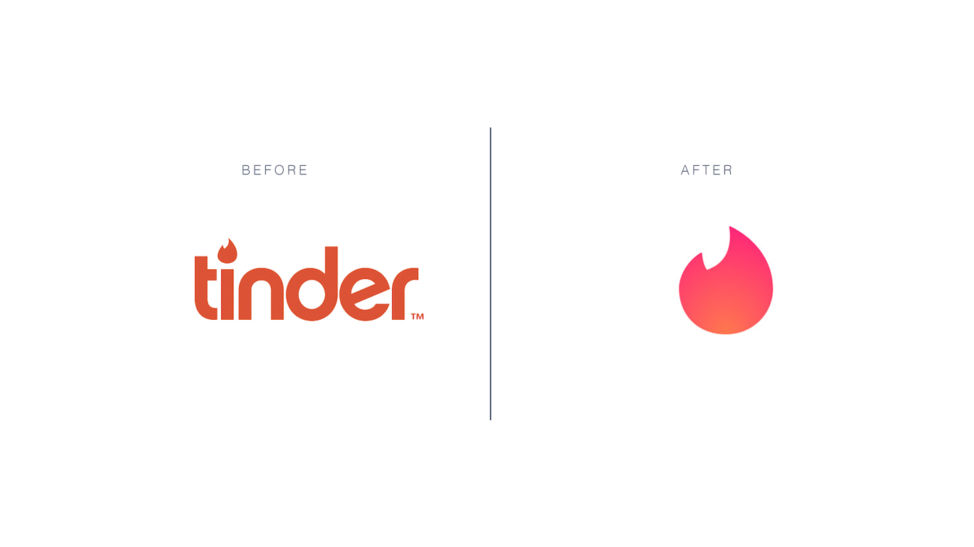
Due to the nature of online dating and modern hookup culture, Tinder’s brand reputation hasn’t always felt sophisticated and classy. However, revealing a more minimalist brand look is a smart way to elevate Tinder’s brand reputation for both users and non-users. Today, Tinder’s simpler logo evokes a sense of trustworthiness and reliability. These feelings are further reinforced by a total app redesign that puts the user’s experience first.
7. Calvin Klein
As a fashion house that’s associated with refined essentials and A-list celebrities, Calvin Klein’s practical wordmark is universally known. This year, Raf Simmons and Peter Saville worked together to launch a new Calvin Klein logo that helps retain and strengthen this powerful identity.
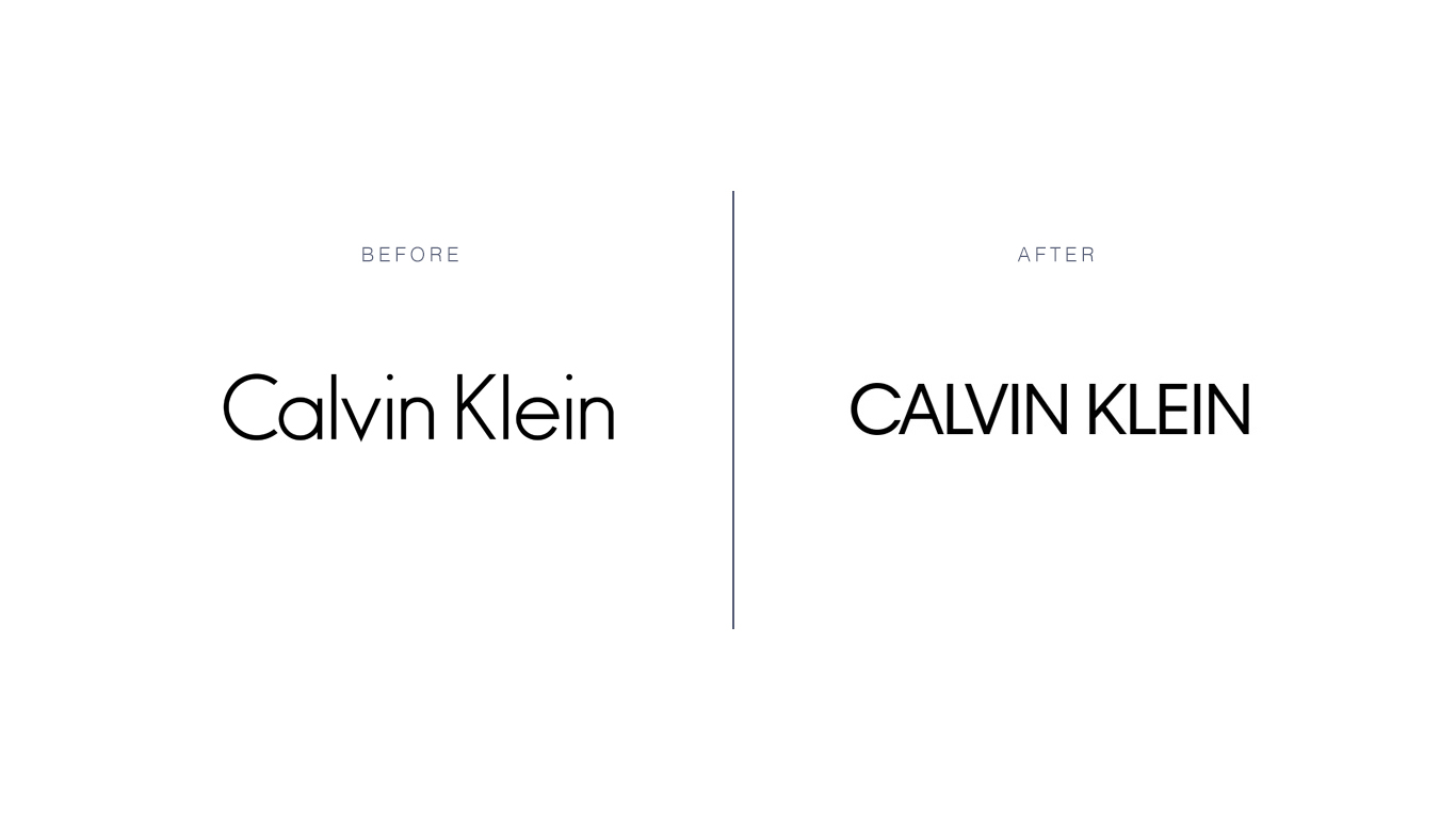
The new uppercase logo appears in a slightly different font that’s bolder than the previous wordmark. This change is primarily an ode to the past, drawing inspiration from the original logo to honor and celebrate the design brand’s foundations.
The past few years have seen many logos return to their original look, and Calvin Klein’s vintage-inspired change shows that this trend is only poised to grow in the coming months.
8. Mozilla
With a desire to “be better known and better understood by their past, present and future audiences,” the new Mozilla logo was born. Mozilla’s new wordmark better establishes its overall role as a champion for internet literacy and accessibility.
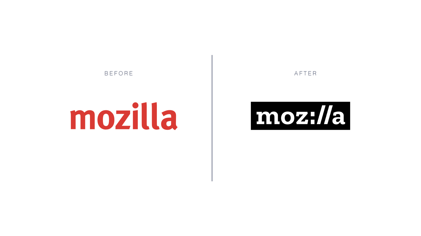
Mozilla worked with Johnson Banks and opened up the rebranding process to public opinion, asking people to weigh in on a variety of rebrand options. The end result is an off-beat logotype that‘s neither too funky nor too traditional. Instead of using the letters “I” and “L,” the logo borrows a colon and two forward slashes from the address bar of a web browser. This ingenious solution creates a clear association between Mozilla and fundamentals of internet access.
9. Thorn
The brainchild of Ashton Kutcher and Demi Moore, Thorn is a charity that seeks to protect children from trafficking and online abuse. In partnership with the agency Wolff Olins, Thorn rebranded its image to assume a more positive and proactive role in keeping kids safe.
Thorn’s new brand identity helps double down on its mission statement in a number of key ways. First, the logo features an uppercase wordmark alongside a sharp thorn image. The thorn supports ideas of defense and safety, helping people associate the brand name with the purpose they serve.
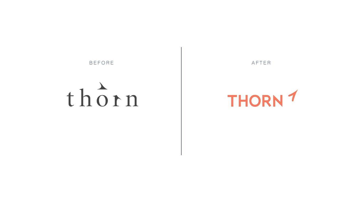
These thorn images are echoed throughout the organization’s new brand identity in varying shades of navy blue, orange, and a crisp shade of white. While the primary logo features a soothing, child-like orange color, the brand’s navy blue accent color provides a sense of authority and protection.
10. Batch Organics
From Natural Blender to now, Batch Organics, this brand delivers organic and frozen smoothie ingredients straight to your door. While it capitalizes on two growing markets – subscription boxes and all-natural food – it also competes in two extremely fierce industries.
To carve out a stronger market presence, Natural Blender worked with the agency Ragged Edge to launch a new and improved version of itself. To better cater to its audience (the busy professional who wants to eat well) Natural Blender changed its name to Batch Organics. And, they adopted a sans-serif logo in bright, fresh pink that reminds of fresh fruit on a bright summer day.
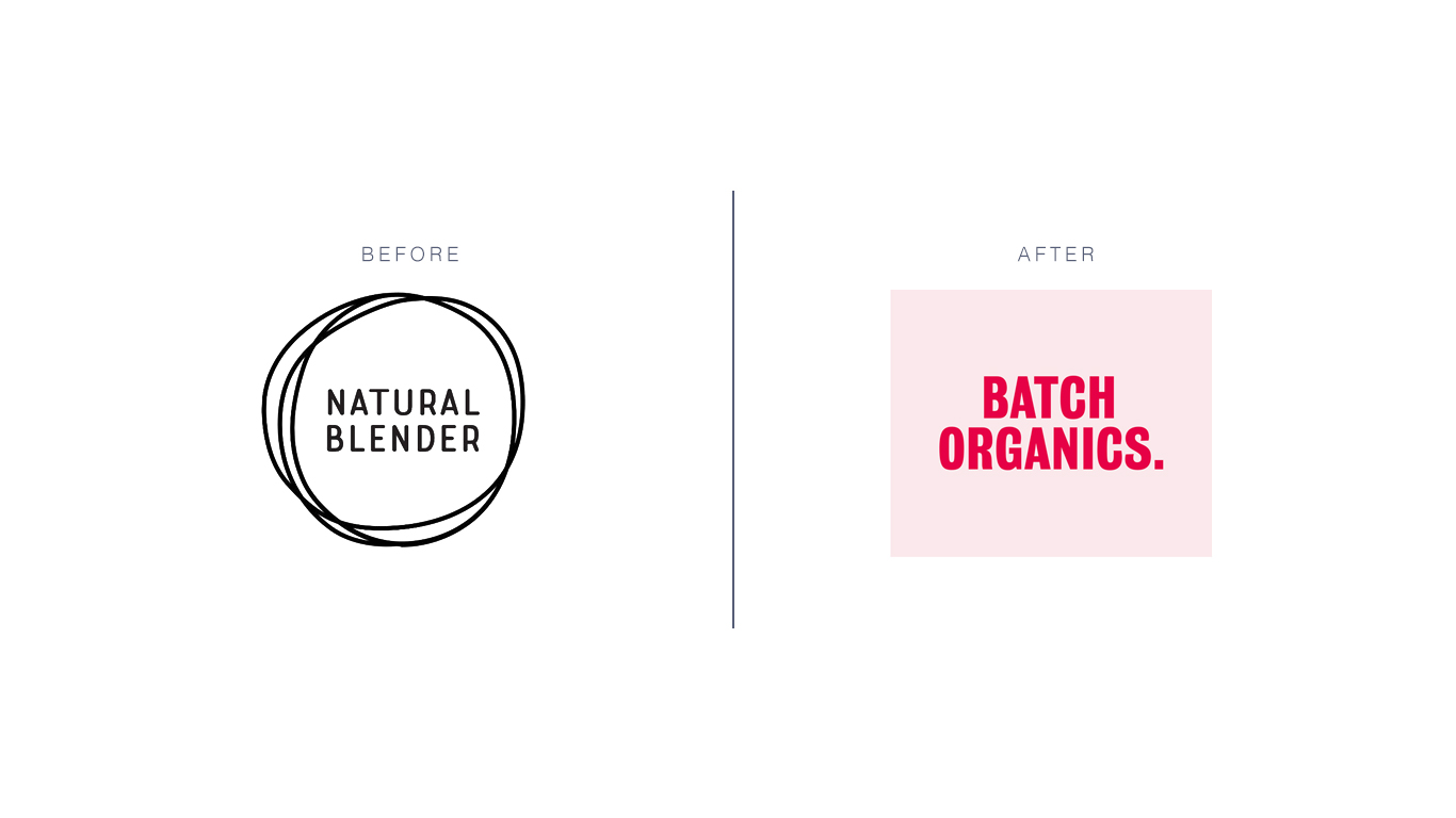
Batch Organics also assumes a no-nonsense tone of voice with phrases like “No Hype. No Hassle” and “Straight Up.” These terms, in addition to the fact that the logo has a period after it, bolster the brand’s commitment to whole, natural foods. This rebrand exemplifies how a strong tone of voice can support a brand’s visual image to create a memorable identity.
11. eHarmony
As one of the first major players in the internet dating scene, eHarmony knows a thing or two about building digital relationships. But when it comes to logo design, its expertise hasn’t always been as sharp.
That all changed in 2017, when eHarmony revealed its versatile new logo to the world. The most shocking aspect of this logo is that it’s infused with color – a far departure from the monochromatic logo variations of the past. It also features a lowercase “h,” which steps away from the internet’s early days and repositions the brand for a modern audience.
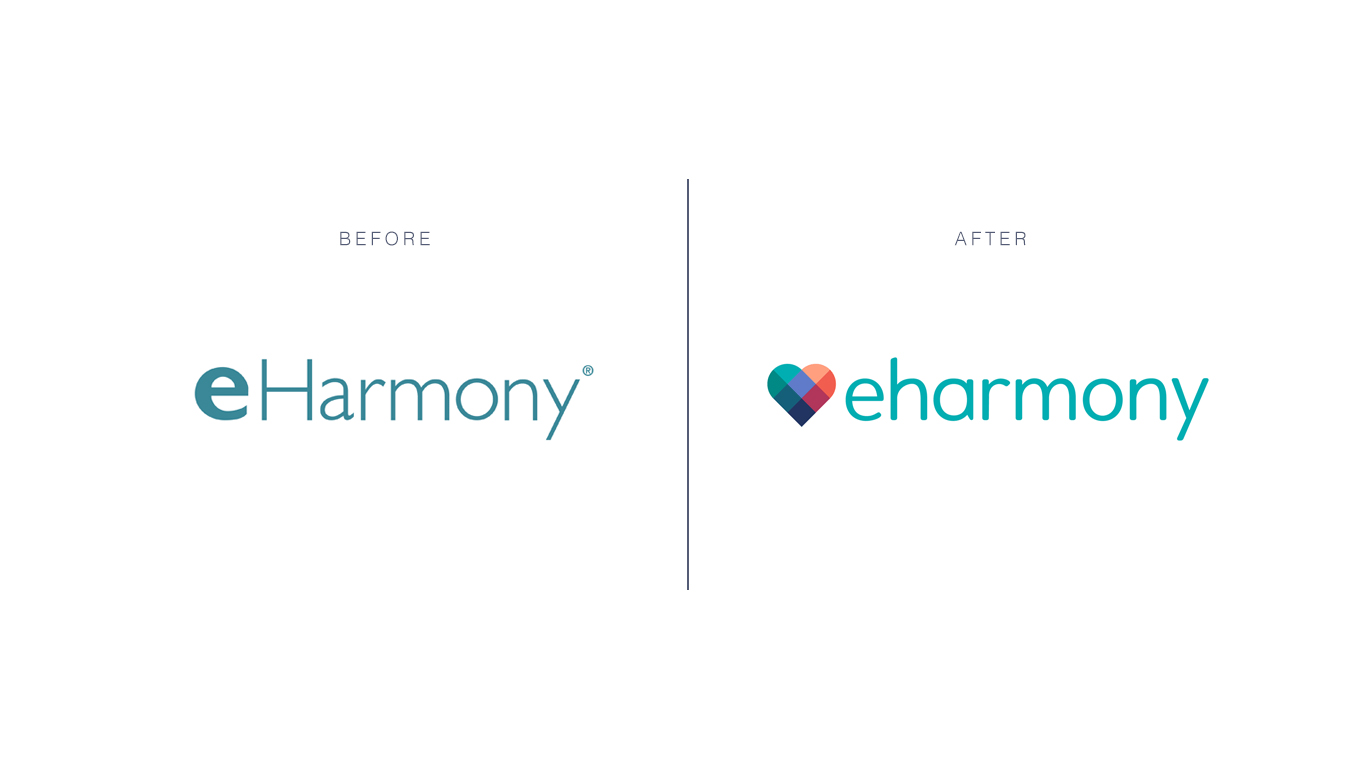
In a highly competitive market, eHarmony’s long standing brand was at risk of falling behind. However, its updated visual identity helps anchor eHarmony as a key player amongst the leading dating apps of today.
12. SyFy
We all know SyFy for reruns of shows like The X-Files and Star Trek. But its original series – which have received critical acclaim – aren’t as popular amongst sci-fi enthusiasts. To boost brand awareness and emphasize its role as a Sci Fi programming expert, SyFy ditched its curvy purple wordmark for an electric-green, geometric type.
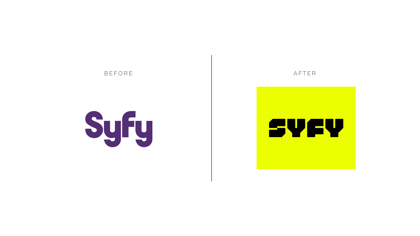
The change abandons almost all of SyFy’s previous design rules, helping establish a fresh identity against competitive forces like AMC and HBO. The update helps SyFy solidify the meaning of science fiction while encompassing a variety of original shows and book adaptations that advance the genre’s boundaries. The new font also assumes an editorial-inspired type – a nod to the events and industry news the channel often broadcasts.
Redesigning your logo is one of the smartest ways to keep your brand relevant and exciting. A strategic brand refresh can also have long-term rewards – but only when done well. Getting a great logo redesign is possible only if you cooperate with professionals. Our website design NYC-based company is always delighted to provide outstanding services meeting and even exceeding the clients’ expectations.